

Identidad gráfica y naming para banca
Dinevo
junio 2020
RETO
Esta empresa de microcréditos de origen finlandés, busca una nueva imagen y naming para abrir una filial en España. Para ello deberemos analizar su público objetivo, la adaptación a la cultura, el entorno del sector y su competencia en nuestro país. Además debemos otorgarle a la marca una imagen de cercanía, seriedad y seguridad.
SOLUCIÓN
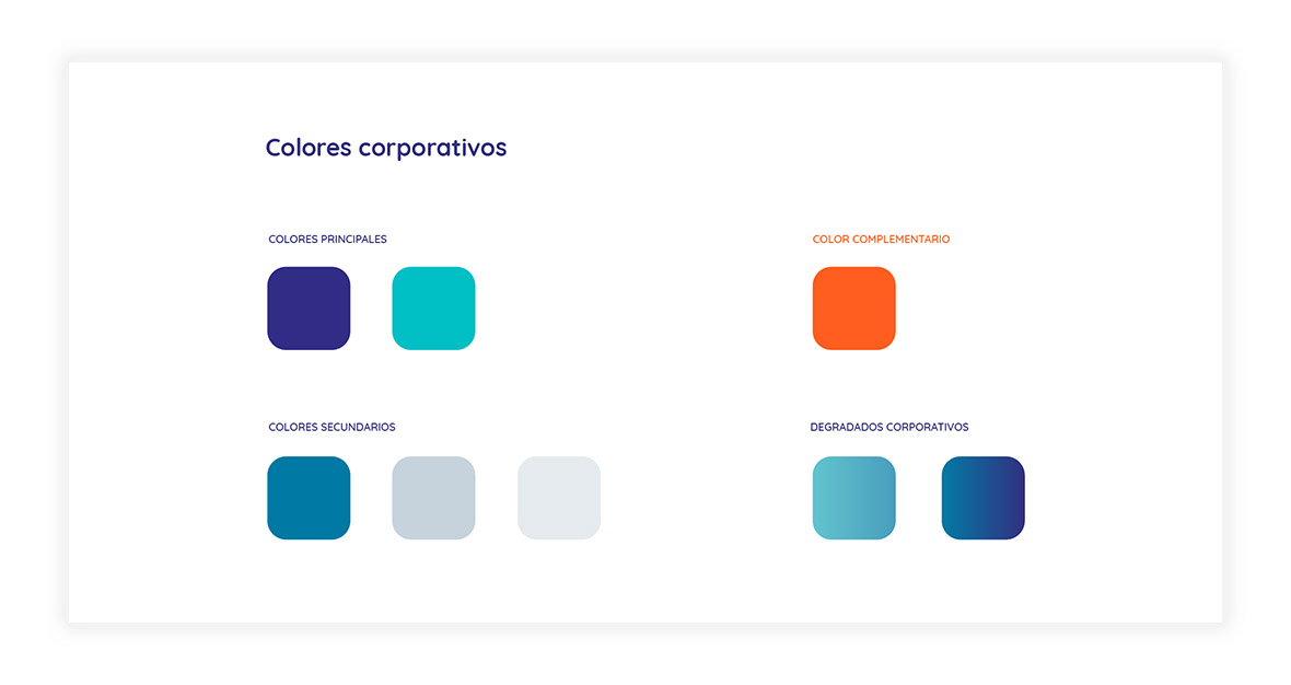
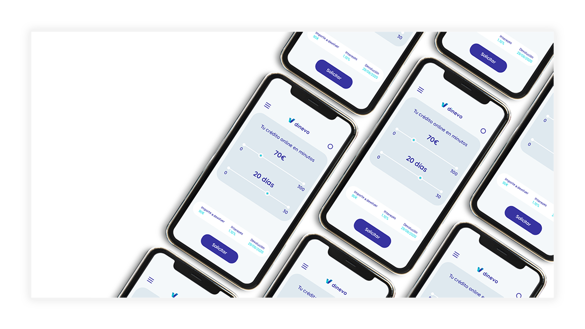
Un naming muy claro y evocador del producto, con una imagen iconográfica que representa el crecimiento financiero, la validación y la letra «V». Además, los tonos azules, colores claros y limpios, aportan seriedad y compromiso. El tono naranja contrasta, para compensar el frío que representan los colores azules y aportar cercanía.
We hired Blubber among 9 candidates to create and exploit our brand. This included: Brand name, visual identity, tone of voice and book of style. When we completed this 1st milestone we understood they were out best choice to create our website at Dinevo.es. They also take care of SEO and the management of our social media, including the delivery of post in the web blog and in the Dinevo Facebook and Instagram pages. I can say Blubber contribution has been key in the achievements we got so far. Apart from their technical knowledge and profesionality, what I'd highlight from Blubber is their capacity to put themselves in their clients' boots. This made everything much easier, smoother and of course more enyoable.
ALEJANDRO COSTA GONZÁLEZ
COO en Dinevo